
Branding Concept:
Saint John Vianney Seminary
Saint John Vianney College Seminary in Saint Paul, Minnesota, is my alma mater. During my senior year there, I began working on a revised version of the House’s Coat of Arms. This process, and the resulting search for way to apply it, quickly turned into conceptualizing a total revision of the logo.
Although it gives a whole description of the re-brand proposal, I am continually adding content to this page — so check back if you’re interested!
OBJECTIVE:
Revise the Seminary’s branding, with primary focuses on
consistency, modernization, and versatility.
PART I:
The Crest
STARTING POINT:
Original Coat of Arms
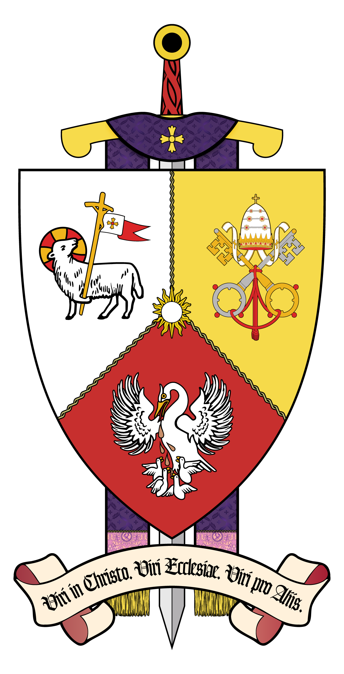
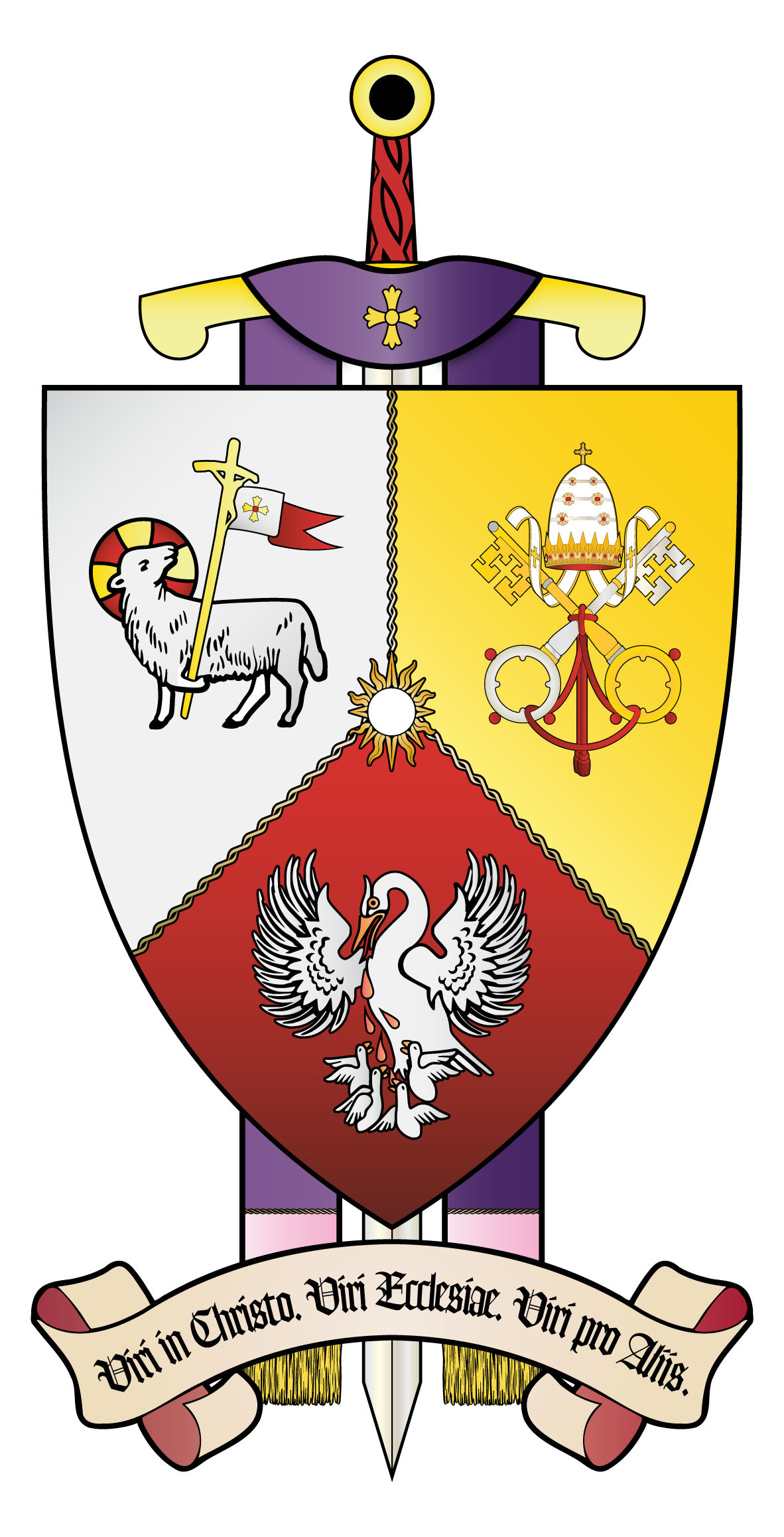
The House Crest of the Saint John Vianney College Seminary was designed in the early 2010’s by a group of seminarians. As is usual with heraldic art, the imagery is important, as it communicates a lot of info in one unit. In this particular case, the Coat of Arms contains seven important elements: The main divisions of the crest include the three that are most integral:
The Lamb of God — representing Christ.
The Holy See’s emblem — representing the Church.
The Pelican — representing others.
Together, these draw from the Seminary’s motto: men in Christ, men of the Church, men for others — this is explicitly stated (in Latin) in the banner at the bottom.
Where these three sections meet in the center, there is the sun, a symbol which, in Catholic art, is often associated with Saint Thomas Aquinas. (The seminary is on the campus of the University of St. Thomas, which is named after him.)
Behind the main shield, there are two other important elements:
The sword, harkening to the Coat of Arms of the Archdiocese of Saint Paul & Minneapolis (where the seminary is located), a traditional symbol of Paul the Apostle.
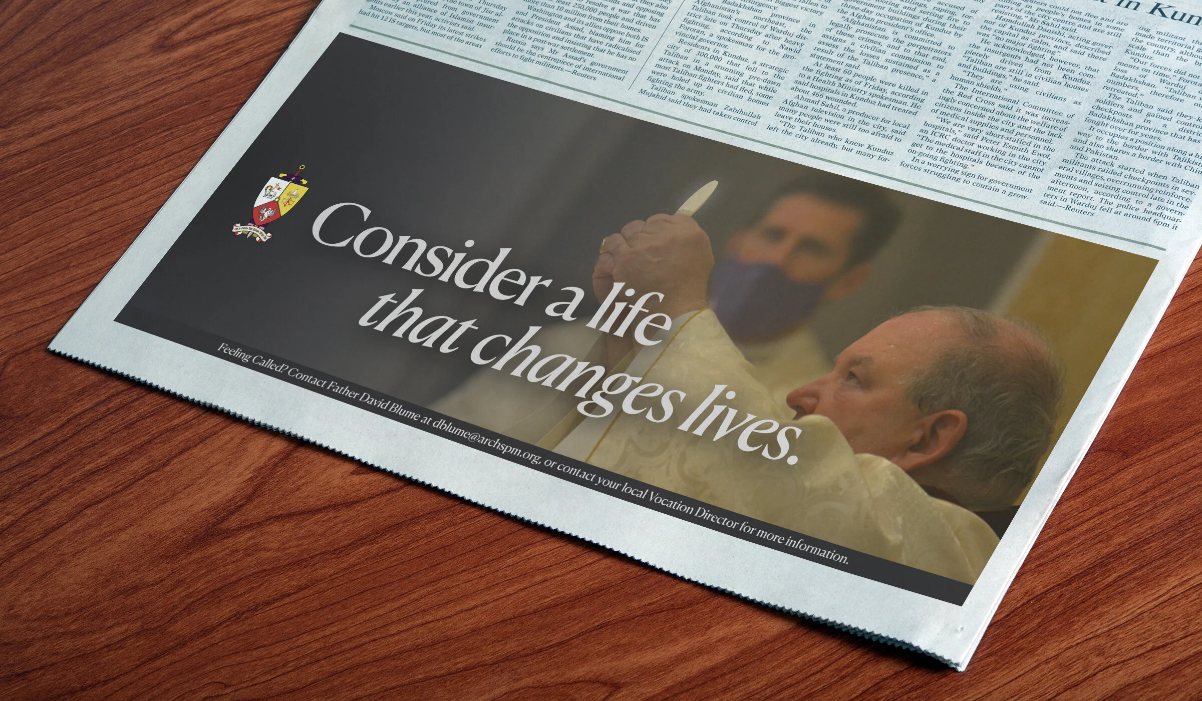
The stole, which is purple. In the Latin Rite Catholic Church, priests almost always wear purple stoles when hearing confessions; the seminary’s namesake/patron is known for spending hours in the confessional for days at a time.
PROCESS:
Objectives in Detail
Standardization

Color consistency is key
The very first thing that I did was to set a color scheme. In addition to white, the color palette is presented here. The only deviations from the five shades shown here comes in certain details of the Holy See’s emblem.
It helps that red, yellow, and black have all been colors associated with SJV for some time — the “JAXX” jerseys, for instance, that the seminarians don during the annual Rector’s Bowl, are black text on a red body.
Modernization
Determining an Aesthetic
I felt the Coat of Arms’ update needed to be one or the other: either a more traditionally-heraldic or a more clean and modern look. I chose the latter, given the circumstances — the Crest, in this particular case, should have the ability to be visible and understandable on things like stationary and apparel.
So, my first step was to re-create each of the individual elements. The challenge was to do so while maintaining a clear link to what came before, for the sake of tradition, while also carving a new but consistent ethos for the icons.


Adding layers to the symbolism
Another thing that I wanted to include in this revised version of the Crest was a deeper layer of symbolism. I accomplished this with two very small but, I would argue, significant additions. The first is the Papal Tiara, which now matches the last one worn by a sitting Pontiff — Saint Paul VI, who was Pope when SJV was founded. The second is the shape of the pole held by the Lamb, which is now shaped after the ferula also used by Paul VI, but more commonly associated with Saint John Paul II, whose Pastores Dabo Vobis is at the heart of SJV’s modern formation program.
Updating the Sword + Stole
As shown and detailed above, the backdrop for the main crest is a sword and a stole. I took inspiration from the new Coat of Arms of the Archdiocese of Saint Paul & Minneapolis while at the same time trying to draw a tie to the original. Thus, the handle remains more detailed than the one in the Archdiocese’s recently-revised crest despite the crossbar taking cues from its shape.
The biggest updates to the stole come in two aspects: the pattern and the tassels. The former is a digital replica of the brocaded fabric the SJV in-house vestments are made of; while the latter is meant to add a more realistic version of what was already in the design.
Versatility
Many uses, one Crest
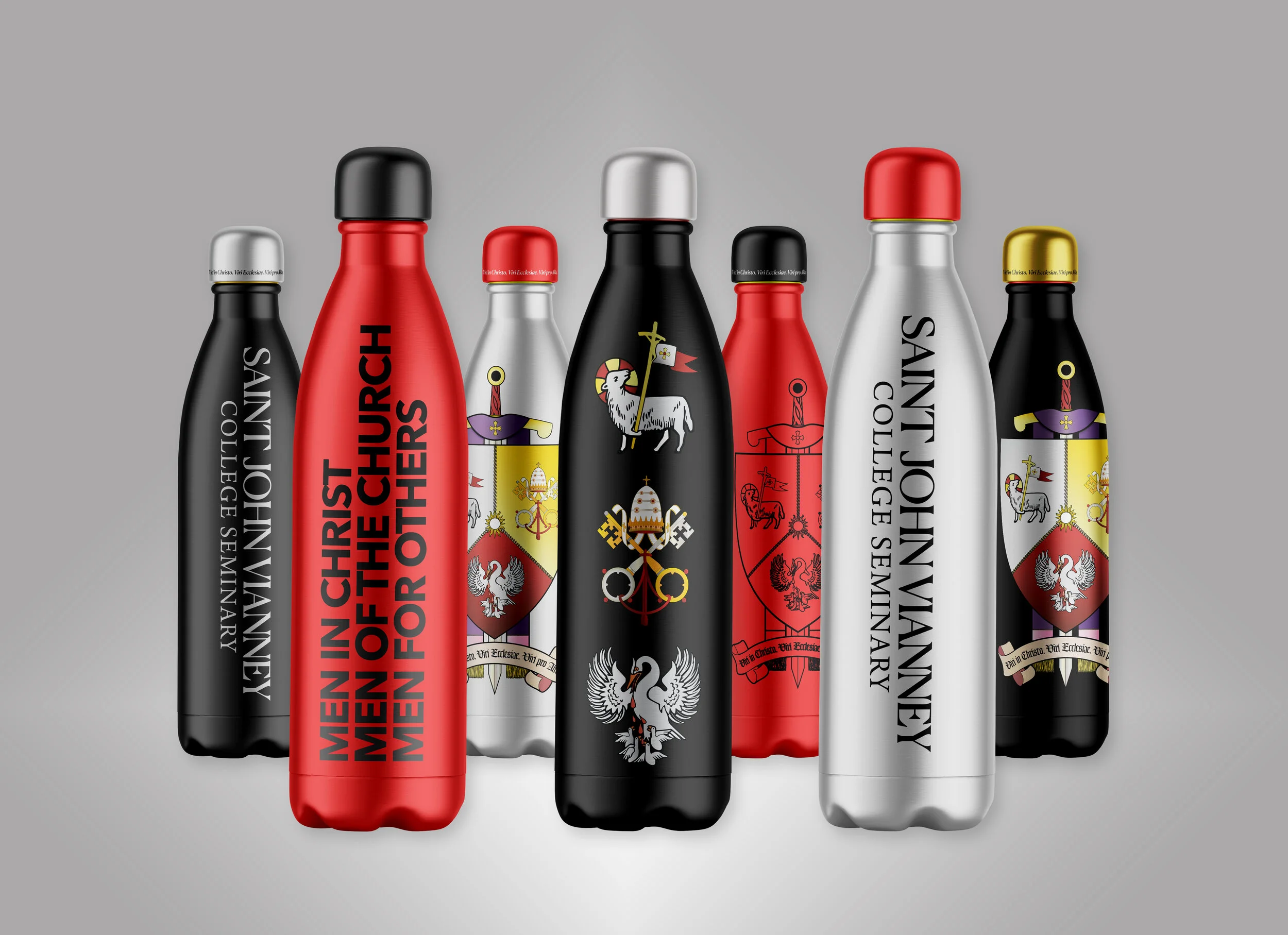
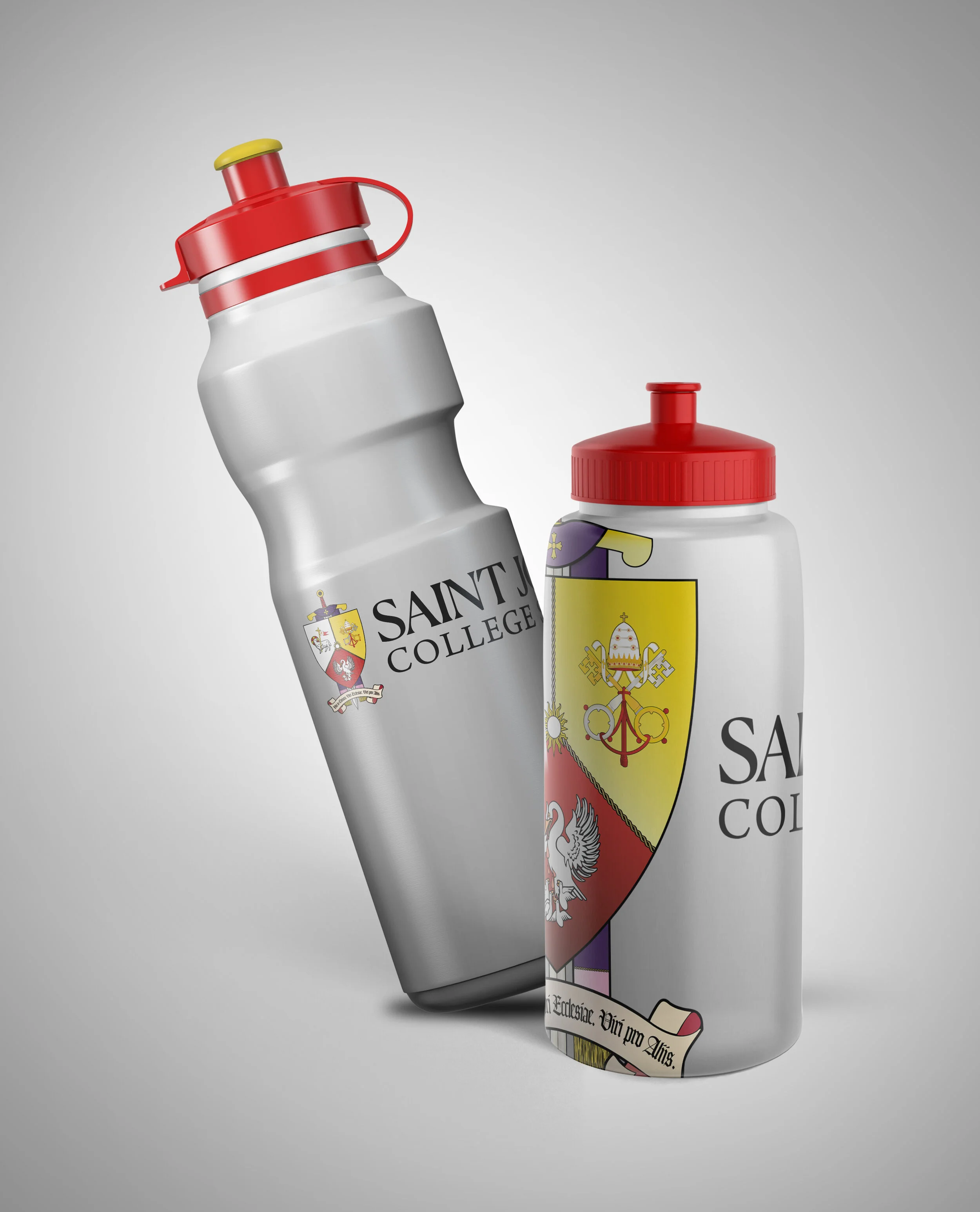
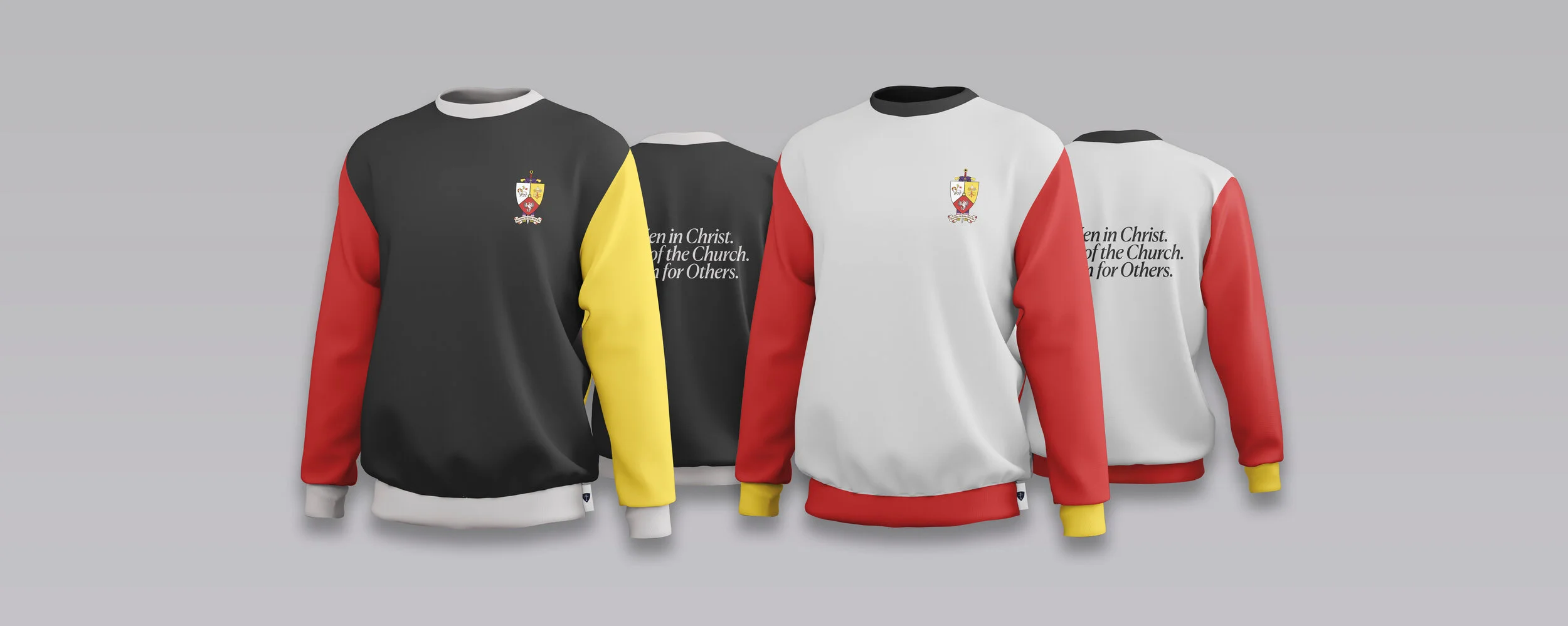
A principal goal the Coat of Arms’ revision was enabling use across various mediums without diminishing its efficacy. On a broad scale, this was accomplished by reducing the level of detail in the elements which became most obscured in the Crest’s reproduction in small sizes — e.g., in stitch work on apparel. A primary example of this is the motto, which, in addition to being rendered in a heavier font, sees its rendering reduced from two lines to one.
To help even more with this, three versions of the revised crest were produced. These can be used interchangeably, depending on the circumstances, yet remain instantly recognizable as the very same design.
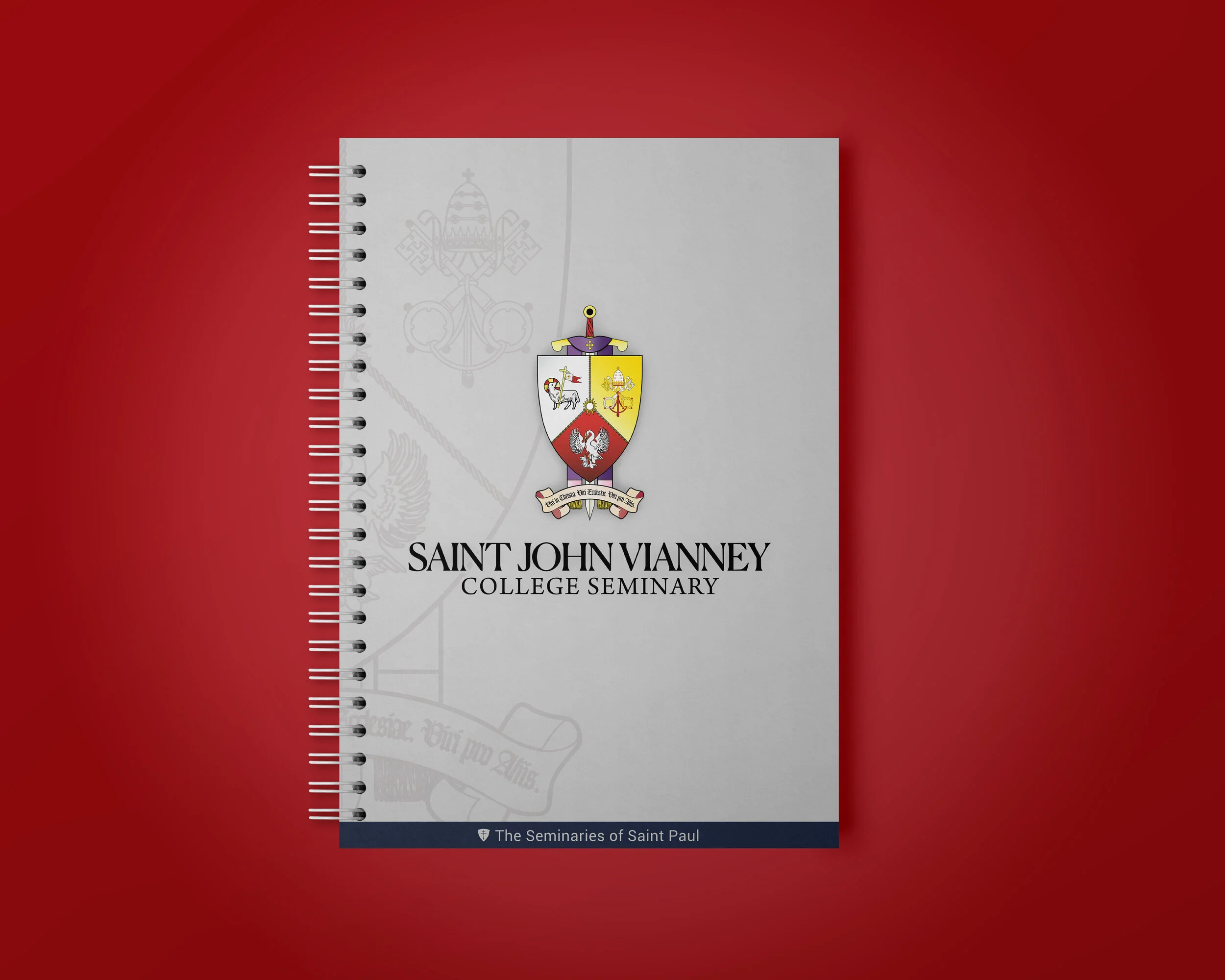
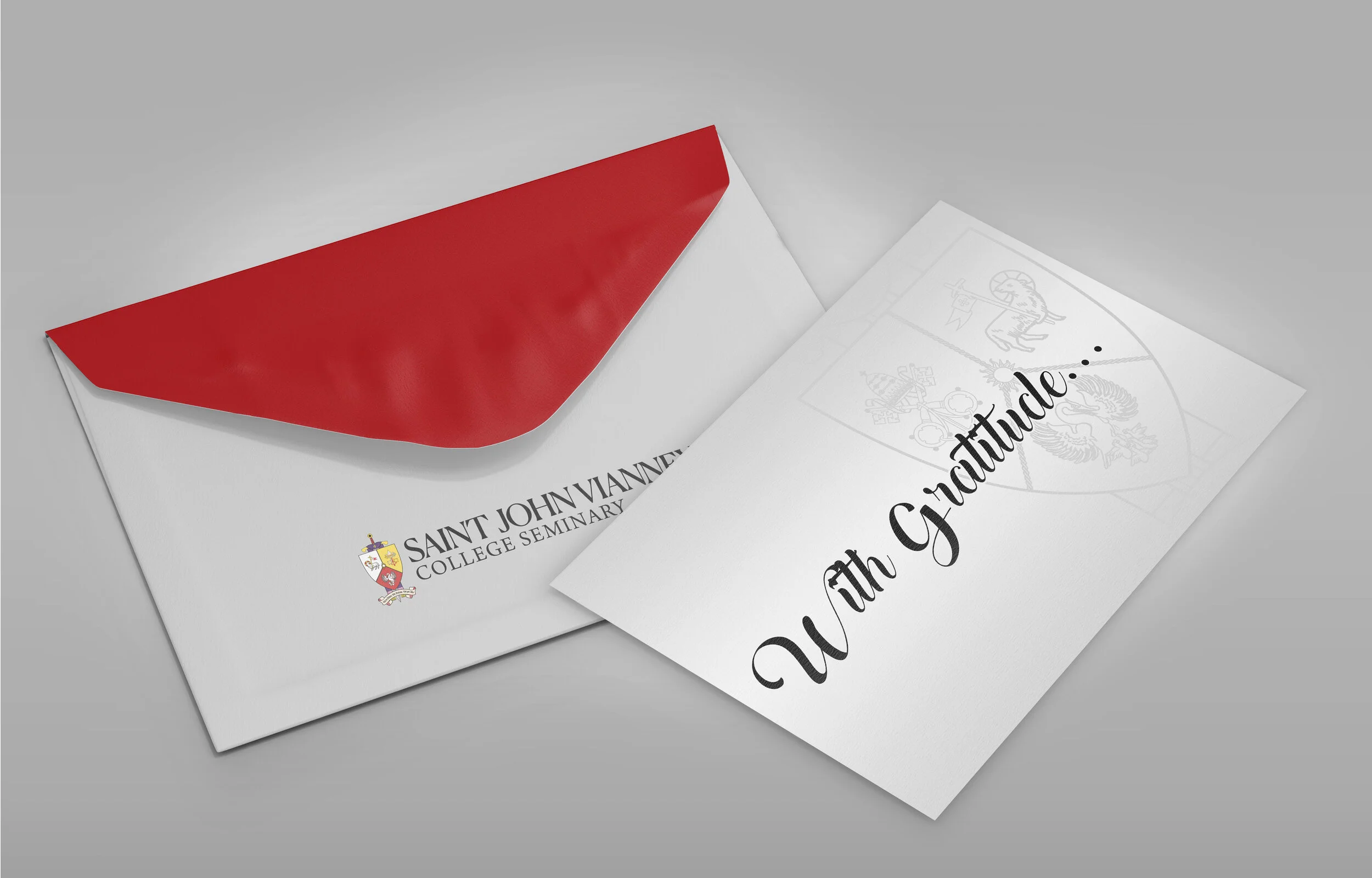
The primary ‘base’ one is the most detailed of the three, working well in printed/paper products
The second is identical to the first, with the exception of a reduction in skeuomorphic elements, such as the brocade designs on the fabric of the stole. This one works well for smaller applications, such as stitch work on clothing.
The third version is based on the more simple version, but replaces the solid colors with gradient fills that stand out boldly in digital media.
CREST REVISION:
Conclusion
Drawing from the Past, Preparing for the Future
The overall goal with this project was to draw out the best parts of the Coat of Arms — which is a truly important thing for institutions deeply rooted in Catholic tradition — while refining some of its aging parts. The finished project does this, without compromising the unique character of a Crest which so accurately communicates important parts of the life, devotion, and spirituality of the Seminary it represents.
PART II:
The Logo
The Logo:
Starting Points
I.
Problems in Existing Logo
In the 2010s, the boards of the Saint Paul Seminary, the Saint John Vianney College Seminary, and their related institutes and formation programs merged to create a cohesive governing body known as the Seminaries of Saint Paul (SSP).
When this occurred, the many entities within the organization were given a standardized branding. While the logo developed is undeniably clean and modern, the result of this change was the loss of instant recognizability for the individual groups. As an example, the Seminaries of Saint Paul organization, the Saint John Vianney College Seminary, the Archbishop Flynn Catechetical Institute, and the Institute for Catholic Theological Formation (see examples below) all, essentially, have the same logo — despite their largely (practically-speaking) unrelated work.
II.
The Motto
Another change to the branding of the organization was the implementation of a universal motto: Joyful Catholic Leaders. This brief ‘mission statement’ of sorts is a helpful + concise expression of guiding principle for everything that the SSP's various organizations do — but it came at a certain cost. For example, SJV's motto has been, for years, Men in Christ, Men of the Church, Men for Others.
And this is not just a catchphrase - it is recited by the community after every time of corporal prayer; featured on the back of seminarians' apparel, and used throughout the building as a reminder of the House's mission and drive.
The Logo:
Conclusion
So, given the strengths of this branding method, my work had a simple objective: to revise the brand identity of Saint John Vianney, while maintaining a connection to the consistent in approach + ethos with the Seminaries of Saint Paul design philosophy but simultaneously preserving a unique identity for the college seminary.
The final result does this by maintaining the basic layout of the Seminaries’ logo, while utilizing the revised crest specific to SJV and a more complementary font.