
Logos
Selected logo designs from over the years. Many are redesign ideas; for comparison, they are shown beside originals.
Slideshow can be navigated using the side arrows.

Vianney Media is the student-run media apostolate of Saint John Vianney College Seminary. When the Seminary's logo was updated in 2019, I designed this logo for the apostolate to match it. (Click on the image to see go to the Seminary's website.)

Saint John Vianney College Seminary in Saint Paul, Minnesota, is my alma mater. During my senior year there, I began working on a revised version of the House’s Coat of Arms -- this constitutes a more developed logo based upon it. (The left is the Seminary's existing logo; click on the image to open a detailed description of the process of the revision.)
![Concept work: VanHaren Electric, Inc an electrical engineering contractor based in Byron Center (Greater Grand Rapids Area), Michigan. [Click the image to view a more detailed logo proposal.]
You can check out VanHaren Electric at http://vanharen.co](https://images.squarespace-cdn.com/content/v1/608833b57a44e719690c5d07/87ac91dc-5318-41b4-9054-b8b29fc14f95/VanHaren_VanHaren.png)
Concept work: VanHaren Electric, Inc an electrical engineering contractor based in Byron Center (Greater Grand Rapids Area), Michigan. [Click the image to view a more detailed logo proposal.] You can check out VanHaren Electric at http://vanharen.com/

Concept Work: Triumph International/The Michael Jackson Company, two names used for the production companies which were owned by Michael Jackson during his life and are now controlled by his estate. They share a logo (left) — but, given its age, is looking a bit aged. My concept combines the names while keeping a consistency in the imagery of the particular dance move.

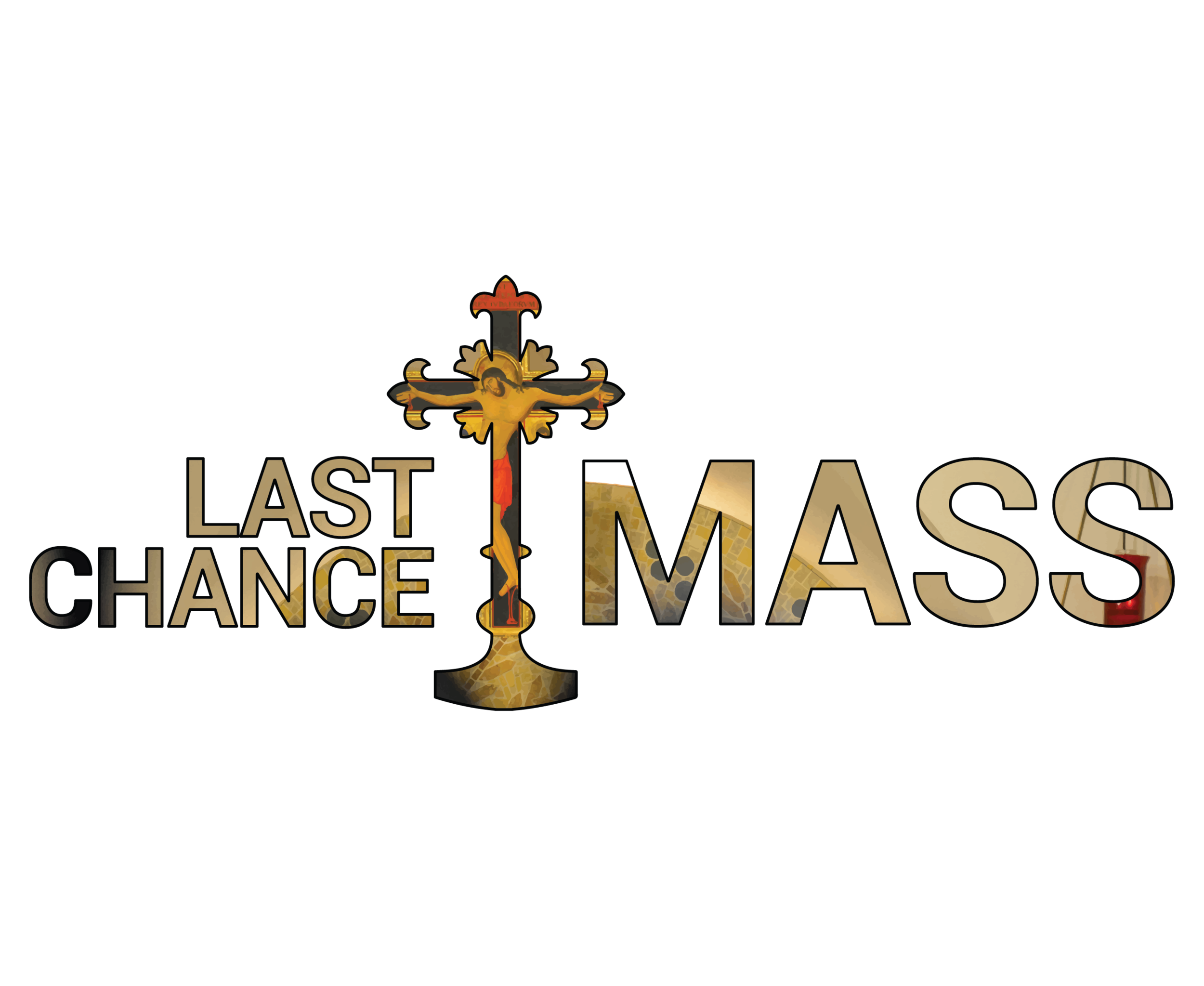
Last Chance Mass is an apostolate of Saint John Vianney College Seminary; a Mass offered at the end of Sunday evening for on-campus students, celebrated in the chapel of the Seminary. Some important aspects of this design are the artwork in the back, which is a photo on the chapel where the Mass is celebrated and the shape of the cross in the middle, which is an outline of the crucifix which sits in the center of the chapel’s altar.

Concept Work: The United States Conference of Catholic Bishops (USCCB), the body of episcopal leadership in the country. While their current logo isn't 'ugly' per se, it's also pretty bland; when the icon is alone (especially when its not green, the traditional color of bishops in the Catholic Church), it says very little about who and what they are. (Click on image to be taken to the USCCB's website).

Concept: PYUR

These are monographs of my initials; click on the image to go to the About Me page, where you can read about what they are and what they mean.

Concept: Svet Mira media/advertising firm. The name is an English transliteration of the Russian “Свет Мира”, meaning “Light of the World”. (Click image to read more.)
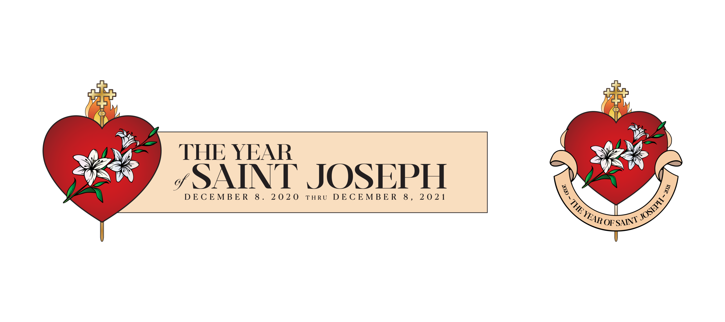
The Year of Saint Joseph: Called by His Holiness, Pope Francis, at the end of 2020, it will last until December 8 of 2021. A Facebook profile photo frame of an earlier version of this has been added to over 1,000 profiles -- click the image to add it to yours!
![These are my two of top proposals for the logo for AEJMC 2022. (Click image to see my explanation work, drafts, and to be linked to their website to learn more.)
[From AEJMC's website] "The Association's mission is to promote the highest possible st](https://images.squarespace-cdn.com/content/v1/608833b57a44e719690c5d07/1626362853150-JUJVUAYNNQ9K6DMS03HJ/0c.%2BAEJMC%2BLogo%2BCOmps.jpg)
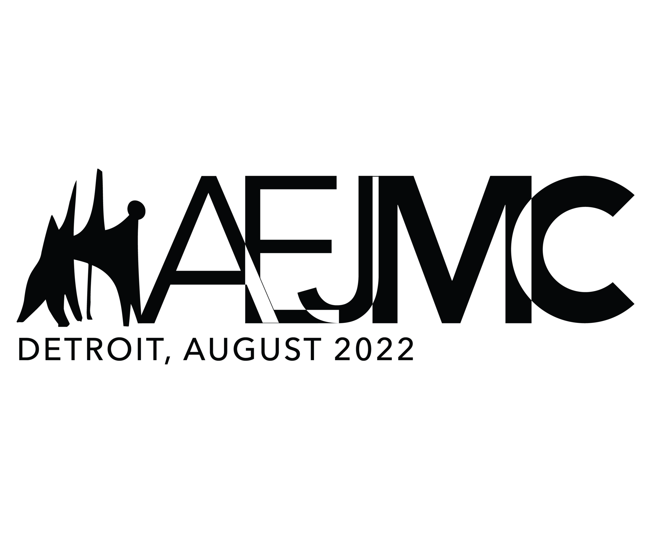
These are my two of top proposals for the logo for AEJMC 2022. (Click image to see my explanation work, drafts, and to be linked to their website to learn more.) [From AEJMC's website] "The Association's mission is to promote the highest possible standards for journalism and mass communication education, to cultivate the widest possible range of communication research, to encourage the implementation of a multi-cultural society in the classroom and curriculum, and to defend and maintain freedom of communication in an effort to achieve better professional practice and a better informed public."
At A Glance